SUPERMAN RETURNS
THE LADY IN THE WATER
PAN'S LABYRINTH
Of the three, I like the PAN'S LABYRINTH poster best, because it is scene- rather than personality-driven, and also because it is clearly a painting -- and a rather Freudian one, at that. The SUPERMAN RETURNS art, whose overhead art seems to deliberately echo Dalí's Crucifixion, is handsome but not the kind of poster I would choose to frame and hang. Bill shares my doubts that THE LADY IN THE WATER is a painting at all, as it seems more like a Photoshopped photo, but we agree it's an arresting image. (Though, to my eyes, it looks less like a lady in the water than Elijah Wood bundled up for a winter walk.) In fact, this LADY IN THE WATER poster reminds me of one of the last photographic one-sheets I liked enough to buy: Wes Craven's DEADLY BLESSING.
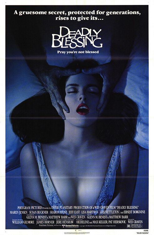
In the Craven film itself, the scene depicted by the poster involves Sharon Stone (then a relative newcomer) being held in place as she dreams of an overhead spider falling into her mouth. I liked the movie better than most of Craven's stuff, but still not enough to have acquired the poster as a memento. I was sold on the poster because it was a rare example of a standout horror moment being restaged as a promotional image; Stone does not appear on the poster itself, and when I saw the film again, years later, I was disappointed to find that the scene didn't play as well onscreen as it did on the poster.
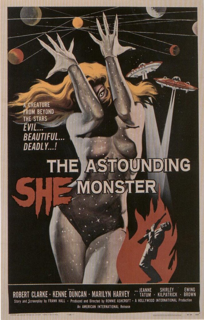 I grew up in the era of Reynold Brown and Albert Kallis, the kings of AIP poster design, and I miss the interpretative angle of their work in today's movie posters. Of course, part of Brown and Kallis' work was to take a cheap film and give its premise as much production value as they could possibly envision. I'll never forget the afternoon I went to the movies as a kid and found myself face to face with Kallis' poster for THE ASTOUNDING SHE-MONSTER; I was maybe five or six years old and it was the first direct hit of eroticism I can remember experiencing. It was on a sandwich board to the right of the red carpet where the ticket buyers entered; it was clearly there to be looked at, but I can remember being torn between my desire to indulge my curiosity and my awareness that I probably shouldn't let anyone catch me looking at it for too long. I hung around the lobby, stealing glimpses from the corner of my eye. When I came back to see the movie, it didn't bear much resemblance to the poster, but the poster had given me the key to daydream about the movie for weeks and years afterward.
Today's movies have all the production value the screen can stand, so today's posters need do little more than nod in their direction. Today's posters show us stars -- not action, not drama, not horror, and sex appeal maybe, but not sex itself. Perhaps there are collectors of today's movie posters, but I can't imagine that they regard them as anything more than paper souvenirs of an experience. Today's posters don't have that larger-than-life, artistic punch that made classic movie posters collectible in the first place.
Given the examples I've shown above, it probably seems as though I collect posters exclusively on the basis of their erotic value, but that's not true. What I look for in a poster, first and foremost, is its ability to astonish me -- either with image, brush strokes, or the artist's ability to summon the entire flavor of a film with an independent work of art. A favorite example of mine is the German poster for the Italian film ATOM AGE VAMPIRE. Regrettably, I don't know the artist's name, but he/she somehow arrived at exactly the right combination of color and caricature to enlarge upon the memory of that black-and-white film experience:
Earlier today I wrote a VW review of the new Shriek Show release of Pete Walker's THE FLESH AND BLOOD SHOW. Its lively, nouveau-like cover art reminded me that David Friedman's Entertainment Ventures Inc. once had in their employ a very unique and talented poster artist. I can remember seeing the same hand at work in the promotional art for THAR SHE BLOWS! and THE ADULT VERSION OF JEKYLL & HIDE, as well. Can anyone out there tell me this artist's name?
PS: Thanks to Christopher Hasler for identifying Bob Peak for me.